
Amrudin Ćatić
Strategy, creativity, and technology are combined to craft digital experiences that perform. Smart marketing meets creative execution, always focused on growth, problem-solving, and real impact.
Tag Archives: analytics
SEO vs PPC vs Social media: Full funnel marketing explained
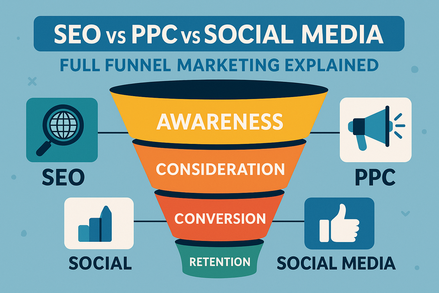
SEO vs PPC vs Social media: Full funnel marketing explained. Learn how each channel works at every stage of the marketing funnel, how they compare, and how to build the perfect multi-channel strategy to grow your business. Understanding the full funnel marketing framework Full funnel marketing is a powerful way to guide people from discovering…
If a “Great” idea needs explaining, it’s not great
A great idea doesn’t need a PowerPoint.It doesn’t need a pitch.It doesn’t need a warm-up, a preface, or a 40-minute TED Talk intro just to make sense. If an idea is truly great, it hits instantly.People understand it in one breath.They feel it before they analyse it. The moment you need to start explaining, really…
SEO vs Google Ads in 2025 recap

This guide delivers a full SEO vs Google Ads in 2025 recap, covering performance, costs, trends, and strategies to help businesses choose the right approach. In the fast-changing world of digital marketing, comparing SEO vs Google Ads in 2025 has become more important than ever. With Google integrating AI deeply into its search ecosystem and user behavior evolving…
SEO Core Web Vitals in 2026: What’s changed and what still matters?
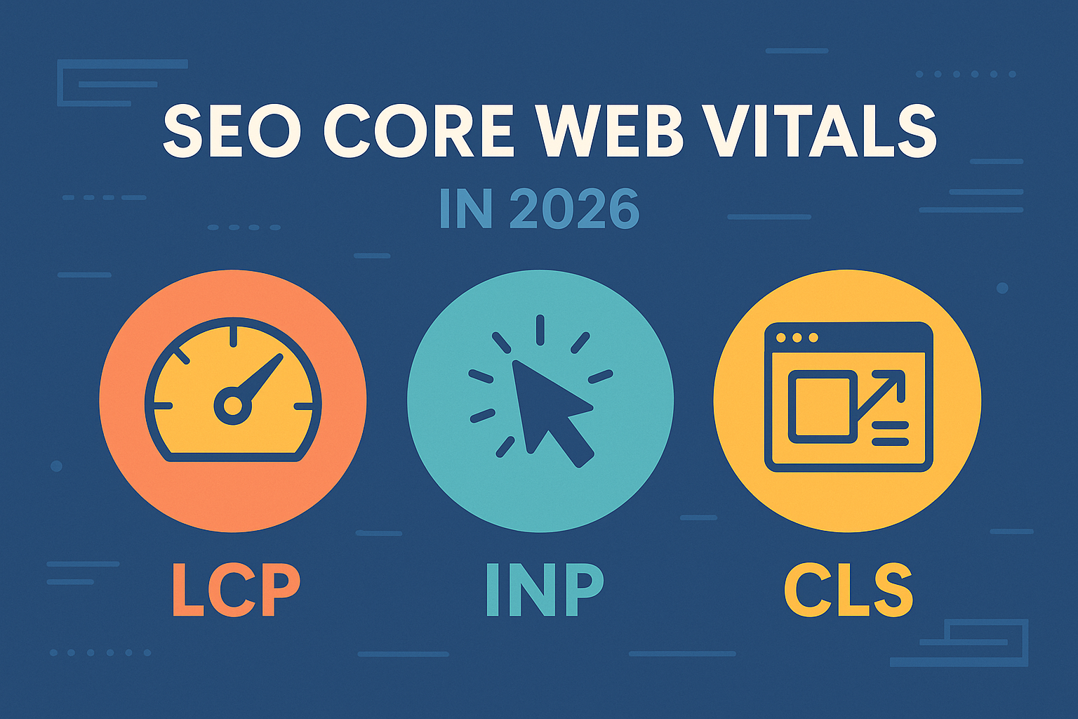
SEO continues to evolve at lightning speed, and SEO Core Web Vitals in 2026: What’s changed and what still matters? is one of the most important topics for site owners, developers, and digital marketers. As Google sharpens its focus on real user experience, Core Web Vitals have gone from “nice to have” to non-negotiable ranking factors. This guide…
PBNs, parasite SEO, and other grey hat tactics: Still alive in 2026?
PBNs, parasite SEO, and other grey hat tactics: Still alive in 2026? Learn how these controversial strategies work today, how effective they are, and whether they’re still worth the risk. Grey hat SEO has always walked the thin, blurry line between what’s allowed and what quietly breaks the rules. As we head deeper into 2026,…
SEO vs GEO vs AEO: Powerful breakdown (What actually matters)
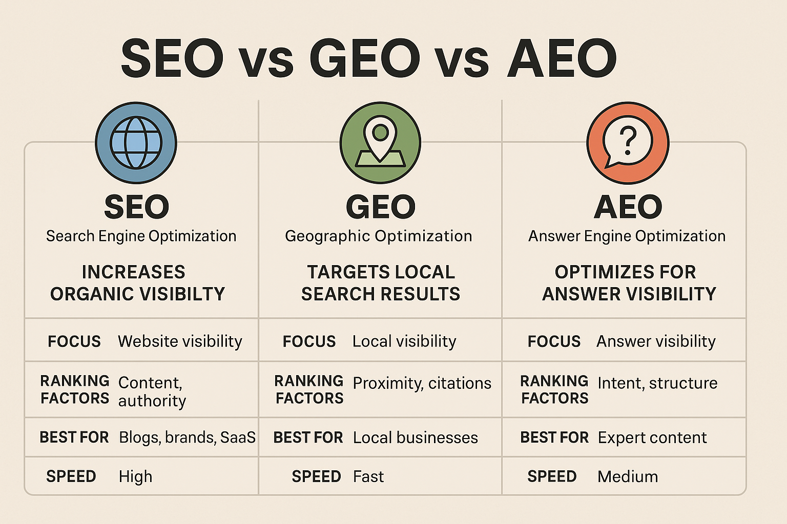
Most marketers talk about SEO like it’s still 2018. They cling to outdated playbooks, obsess over backlinks, and treat “visibility” like it’s one uniform channel. That’s why they lose. The truth:You’re not competing in one arena anymore, you’re competing in three completely different ecosystems, each with its own rules, ranking logic, and failure points. Most…
How to combine SEO and Google Ads for maximum impact
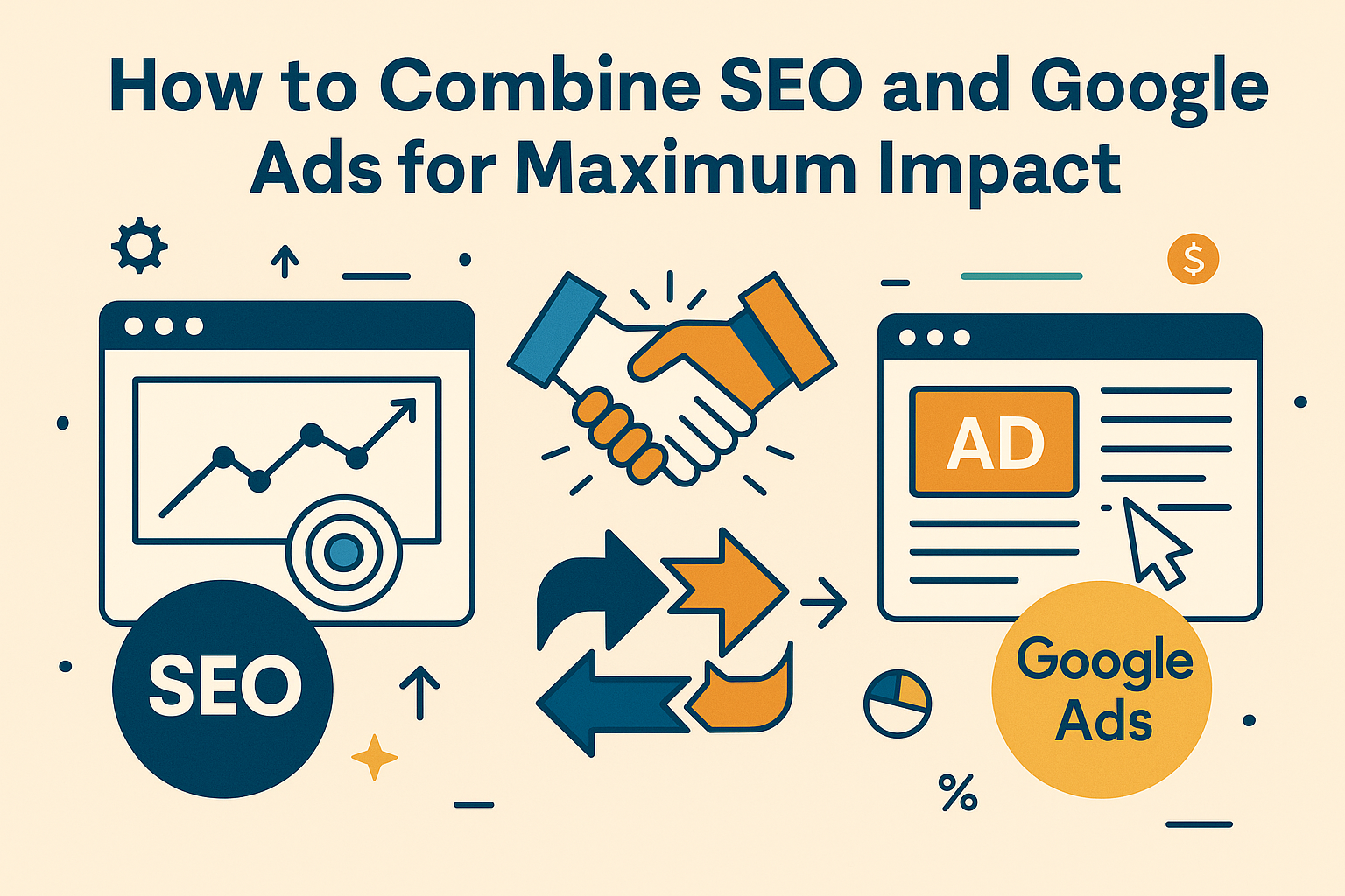
How to Combine SEO and Google Ads for Maximum Impact. Learn the most effective strategy to unify your organic and paid search channels for higher traffic, better conversions, and stronger ROI. Search is a battlefield, and most businesses lose because they split their firepower. They treat SEO and Google Ads like two separate worlds, two…
10 Critical Google Ads mistakes that are burning your budget (and how to fix them fast)
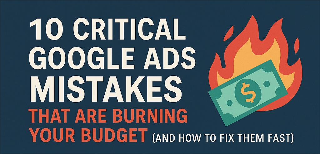
Introduction: Why so many brands waste money on Google Ads Most businesses don’t fail on Google Ads because their product is weak, they fail because their ad structure bleeds cash invisibly. A single mistake in keyword targeting, audience segmentation, or conversion tracking can silently drain thousands per month. If your CPCs keep climbing and conversions…
What metrics actually matter in Google Ads reports? (Hint: Not clicks)
Discover the most important Google Ads metrics beyond clicks, learn which KPIs truly drive ROI, optimize campaigns, and reveal real business performance. The click trap: Why CTR alone misleads marketers Clicks look good in a dashboard. They move fast, create spikes, and make you feel like something’s happening. But here’s the hard truth: clicks don’t pay…
How to track conversions with Google Ads and GA4 – The 2026 guide
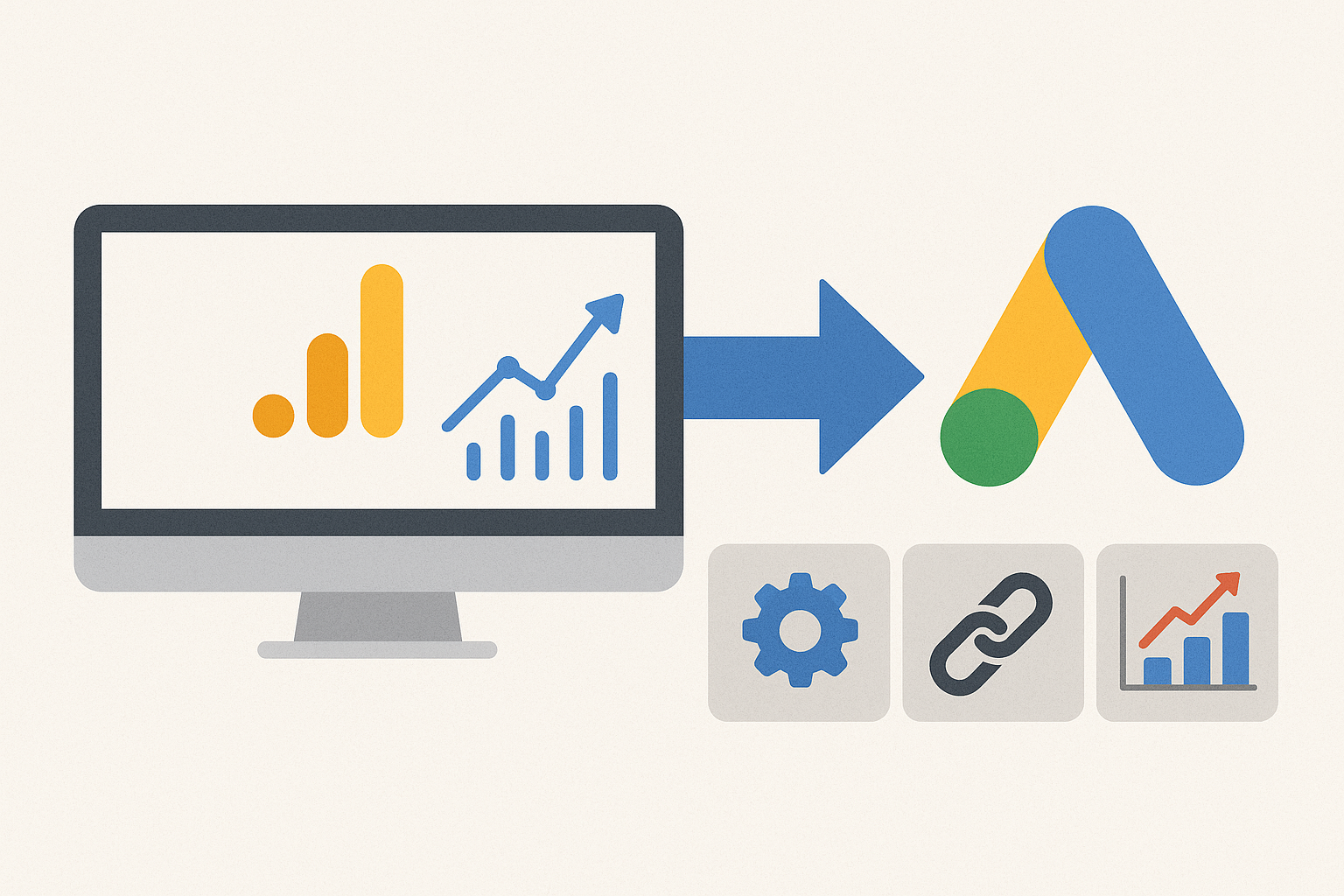
Let’s break down exactly how to set it up, optimize it, and avoid the traps that keep most advertisers blind. Introduction – Why conversion tracking defines campaign success If you can’t measure it, you can’t scale it. That’s the reality of digital marketing in 2026. In this guide, you’ll learn how to track conversions with Google…