
Amrudin Ćatić
Strategy, creativity, and technology are combined to craft digital experiences that perform. Smart marketing meets creative execution, always focused on growth, problem-solving, and real impact.
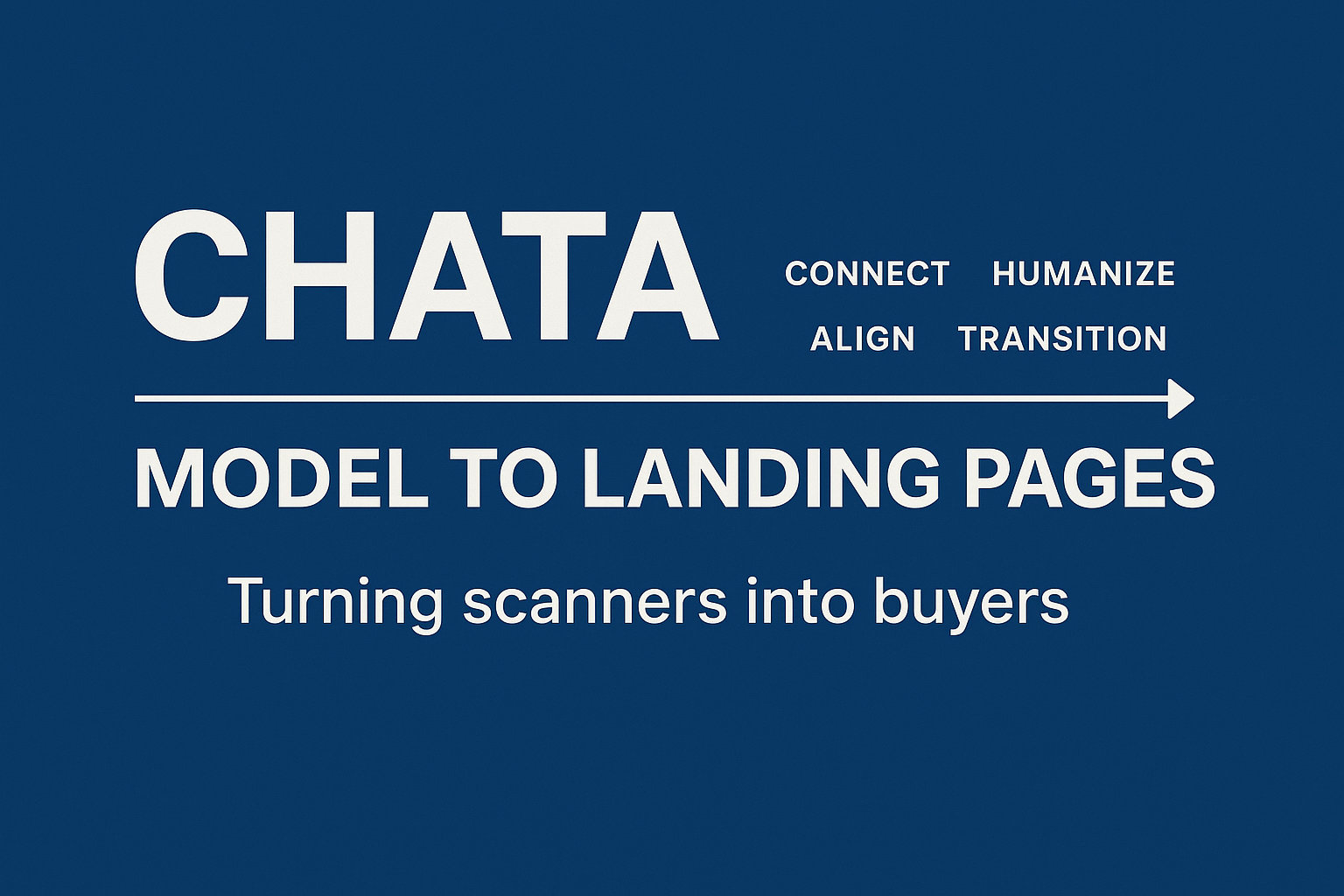
Applying CHATA model to landing pages: Turning scanners into buyers
This article breaks down how to apply the CHATA model to landing pages so scanners turn into readers, and readers turn into buyers.
Most landing pages don’t fail because of design, traffic quality, or tools.
They fail because the message breaks at the exact moment the user is trying to make sense of what the page is offering.
Scroll through 20 random SaaS landing pages, and you’ll see the same problems:
- generic headlines
- unclear value proposition
- zero connection to actual user intent
- forced CTAs that don’t feel earned
- no narrative continuity
- credibility thrown randomly
- UX flow built around the brand, not the visitor
An era shaped by SGE, scanning behaviour, short attention loops, and AI-saturated content means landing pages need more than “best practices.”
They need a communication architecture.
And the CHATA model (Connect → Humanize → Align → Transition → Anchor) is built exactly for this.
Why landing pages need CHATA (Not more templates)
Every landing page tool gives you a template.
None of them gives you a model for how people process information.
CHATA fills that gap by structuring the landing page around human cognitive flow, not design trends.
SGE and search behaviour now reward:
- contextual relevance
- human insight
- alignment with intent
- natural progression
- value continuity
Landing pages built without this structure feel “noisy”, and users instinctively bounce.
CHATA solves this by turning landing pages into guided decisions, not static layouts.
How users actually read landing pages
Modern users:
- don’t read, they scan
- jump between sections non-linearly
- skip intros and jump straight to trust signals
- look for alignment more than benefits
- expect transparent navigation and micro-commitments
- judge credibility in under 1.4 seconds
- use SGE summaries to confirm legitimacy
- trust specificity, not persuasion
Legacy persuasion models were built for linear reading.
CHATA maps to real scanning behaviour, making it a practical tool for landing page performance.
C – CONNECT: The first 3 seconds (Relevance or bounce)
Visitors decide “Is this about me?” before they read a single benefit.
CHATA’s Connect phase focuses on contextual recognition, not “attention.”
This is exactly what SGE and modern scanning behaviour reward.
How to apply CONNECT to landing pages
1. Start with a user-reflective headline
Not what you offer,
but what the user is trying to fix or achieve.
Weak:
“Powerful analytics platform for modern teams.”
CHATA-optimised:
“Your team isn’t struggling with data.
You’re struggling with making sense of it fast enough.”
Context > cleverness.
2. Mirror the user’s language
Your headline should feel like something they said to themselves.
3. Introduce relevance immediately
Add a sub-headline that anchors who it’s for and why now.
4. Avoid “brand-first” intros
Users don’t care about who you are in the first 3 seconds.
They care about whether you understand their world.
Where CHATA fits:
Connect blocks bounce by making visitors feel seen.
H – HUMANIZE: The trust layer that AI can’t fake
Most landing pages sound like they were written by ChatGPT 3.5.
That’s why humanization is now a ranking + conversion factor.
Humanization =
- lived insight
- specific detail
- real examples
- transparent limitations
- founder POV
- proof woven naturally into copy
How to apply HUMANIZE to landing pages
1. Bring insight, not generic claims
“Teams waste time on manual reporting” is useless.
Everyone already knows that.
Better:
“Your team spends 9+ hours a week screenshotting dashboards that nobody reads.”
2. Add founder voice strategically
Not storytelling, clarity.
Example:
“We built this because every tool we used created more work, not less.”
3. Use concrete numbers
Not fake stats.
Real numbers you’ve observed.
4. Proof woven inside the flow
- credibility signals
- case snippets
- short testimonials
- logos
- “trusted by X”
HUMANIZE converts scanners into interested readers.
A – ALIGN: Mapping intent to offer (The conversion engine)
Most landing pages fail here.
Alignment is the moment where the user’s intent meets the true value of your offer.
Without alignment, you get:
- irrelevant CTAs
- confused visitors
- low conversion rates
- bounce loops
- “What does this do?” friction
How to apply ALIGN to landing pages
1. Clarify the core value in one sentence
The value must match user intent, not your internal messaging.
Bad:
“Our AI-powered dashboard streamlines workflows.”
Aligned:
“You’ll get answers in seconds, not dashboards you have to interpret.”
2. Include an alignment section
Show the connection between problem → outcome → validation.
3. Match your offer with user awareness
Cold user ≠ Same CTA as hot user.
4. Use job-to-be-done clarity
“What job are they hiring your product to do?”
Alignment is where users say:
“Yes, this is for me.”
T – TRANSITION: The CTA that doesn’t scare people away
This is where most landing pages collapse.
They jump from “Here’s what we do” → “Start your free trial.”
That’s too abrupt for 90% of traffic.
CHATA’s Transition stage focuses on:
- micro-commitments
- low-friction next steps
- progression, not pressure
How to apply TRANSITION to landing pages
1. Offer micro-steps before the main CTA
Examples:
- “See examples”
- “View demo screenshots”
- “Read the case breakdown”
- “Calculate your ROI”
- “Try the diagnostic quiz”
Let them warm up.
2. Position the CTA after alignment
Not before.
Not randomly.
After you’ve earned it.
3. CTA must feel like the next logical step
Not obligation – continuation.
Scanners won’t convert under pressure.
They convert when the CTA feels inevitable.
Read how CHATA aligns for SEO optimisation, SGE, entities & topical authority.
A – ANCHOR: Retention starts on the landing page
Landing pages rarely think beyond the conversion.
But CHATA’s Anchor stage focuses on:
- continuity
- brand memory
- long-term connection
- familiarity
- expectation-setting
This improves:
- activation rate
- onboarding outcomes
- lifetime value
- branded search
- user trust
How to apply ANCHOR to landing pages
1. Add follow-up pathways
- “Join newsletter for weekly breakdowns”
- “Download the CHATA checklist”
- “See frameworks we use internally”
2. Build a narrative that continues post-click
If they convert, you keep the same voice.
If they don’t, they still remember your message.
3. Repetition of the core idea
Users remember repeated structure more than repeated wording.
4. Use a soft anchor at the end
Reinforce what makes your model or product unique.
Anchor turns conversions into relationships.
CHATA landing page structure (Perfect layout blueprint)
You can build any high-performing landing page using this exact CHATA flow:
- Connect:
Context-driven headline + sub-headline - Humanize:
Short insight + lived experience - Align:
Value proposition + JTBD clarity - Transition:
Micro-commitments → demos, examples, tools - Anchor:
Newsletter CTA / follow-up / narrative continuity
Unlike templates, CHATA adapts to any industry.
Because it’s built on communication psychology.
Real example: CHATA rewrite (Before vs After)
Before (generic LP intro):
“Empower your team with a powerful platform designed to streamline workflows and improve productivity. Start your free trial today.”
After (CHATA-optimised):
Connect:
“Your team isn’t unproductive, they’re drowning in tools that make everything slower.”
Humanize:
“We tested 23 workflow platforms, and every single one added more dashboards, more steps and more reporting.”
Align:
“You need answers, not interfaces. Our platform turns decisions that usually take hours into 30-second actions.”
Transition:
“See the exact workflow examples teams use to cut their workload in half.”
Anchor:
“If you want weekly breakdowns of processes like these, subscribe below.”
No gimmicks.
Just structured communication.
Why CHATA works better than UX checklists
- Based on behaviour, not opinion
- Built for scanning, not reading
- Maps naturally to SGE expectations
- Strengthens E-E-A-T on landing pages
- Improves micro-conversion rates
- Supports SEO and PPC consistency
- Works across industries
UX checklists make you compliant.
CHATA makes you persuasive.
Also, chcek this Google’s helpful content and guidelines.
FAQ (Based on actual search intent)
How do I use the CHATA model on landing pages?
Follow the Connect → Humanize → Align → Transition → Anchor structure to build a narrative that matches real user behaviour.
Is CHATA better than AIDA for landing pages?
Yes. AIDA is too linear and too shallow for modern scanning patterns and complex decision-making.
Does CHATA help with conversion rate optimisation?
Directly. Transition and Align stages map perfectly to CRO principles.
Can CHATA be used for SaaS landing pages?
Absolutely, CHATA is built for intent-driven experiences.
Does CHATA replace UX writing frameworks?
No, it enhances them by adding structure and human psychology.
Conclusion: CHATA turns landing pages into guided decisions
Landing pages don’t fail because of design.
They fail because they don’t communicate properly.
CHATA fixes this through a structure that mirrors how people think, evaluate, and decide in real time.
Connect → relevance
Humanize → trust
Align → clarity
Transition → frictionless flow
Anchor → continuity
You don’t need more templates.
You need a model that makes scanners become buyers.